

Materials That Breathe




The Philosophy: Beyond Black and White
High-contrast design is often misunderstood as simply picking two opposite colors. In reality, it is a tool used to define boundaries and depth. By using a palette of deep obsidian and crisp bone-white, we create a visual "rhythm" that guides the eye to the most important parts of a room. It is the ultimate expression of minimalist logic—stripping away the "middle ground" to leave only the essential.
Why Contrast Works
Our architectural planning service is the bridge between a raw concept and a structural reality. We focus on "spatial logic"—ensuring that every square foot is optimized for flow, light, and purpose. By combining technical precision with a minimalist aesthetic, we create comprehensive blueprints that serve as a definitive guide for high-end construction.
- Focus A dark structural beam against a white ceiling highlights the engineering of the home.
- Volume Dark floors can make a room feel grounded, while white walls allow the ceiling to feel infinitely high.
- Clarity High contrast removes visual "fuzziness," making the edges of your furniture and walls look sharp and intentional.
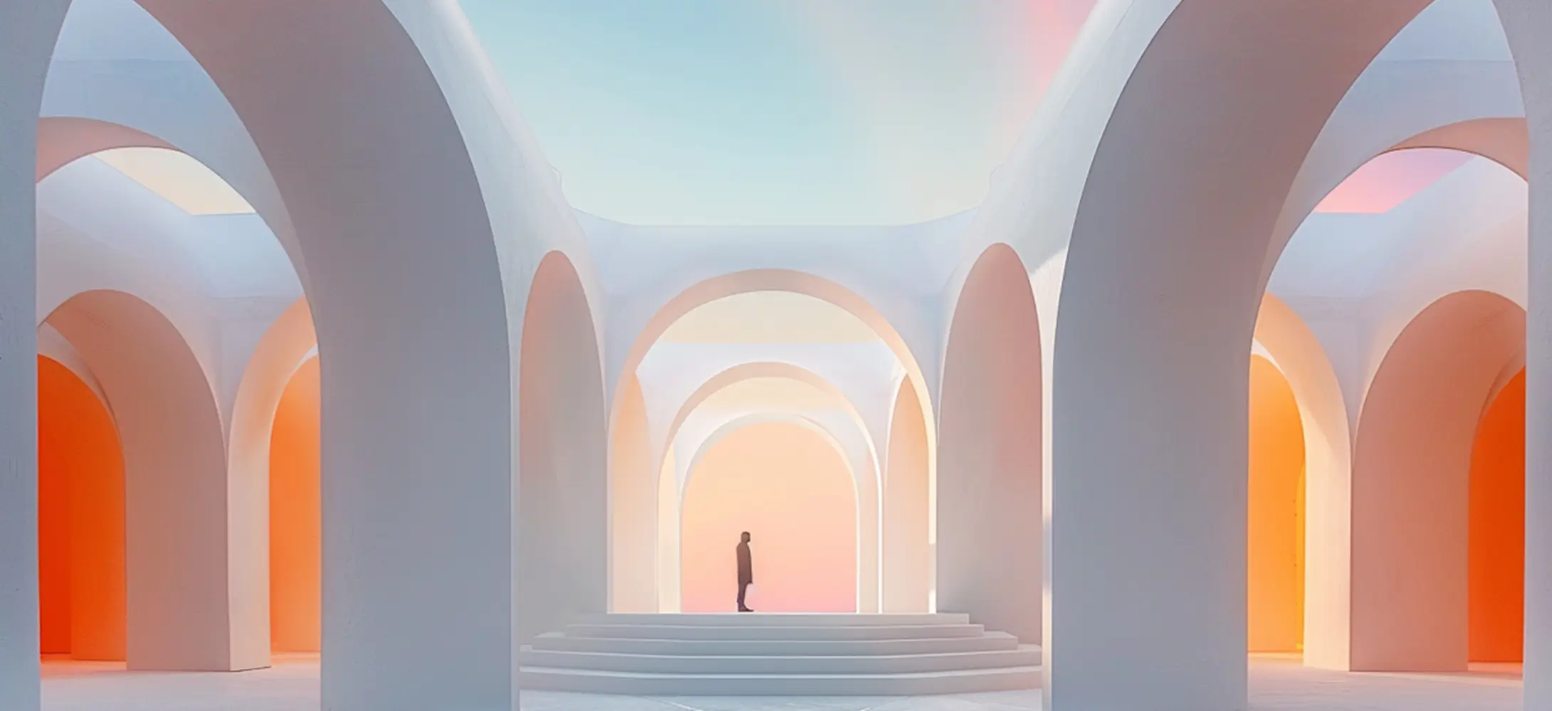
The Nookibo Palette
To achieve this look without making the space feel "cold," we recommend a specific balance:
- The Base (70%) Use a soft, matte white for large surfaces to bounce natural light.
- The Accent (20%) Use deep charcoals or your signature Oxford Blue for structural elements like window frames or kitchen islands.
- The Texture (10%) Introduce raw materials like light oak or grey stone to bridge the gap between the extremes.
Designing with Depth: The Technical Execution
To achieve this look without making the space feel "cold," we recommend a specific balance:
- The Rule of Transitions High contrast can feel "harsh" if not handled correctly. We use transition materials—such as brushed steel or smoked glass—to soften the point where dark meets light. This creates a sophisticated "gradient" effect that feels premium rather than basic.
- Artificial Lighting In a high-contrast room, lighting is everything. We utilize recessed COB (Chip on Board) LEDs to create sharp, linear pools of light. This ensures that during the night, the "Obsidian" elements maintain their depth without disappearing into the darkness.
- The "Weight" of Color We logically place darker tones at the base of the room (floors and lower cabinetry) to "ground" the space, while keeping the upper half light to maintain an open, airy atmosphere.
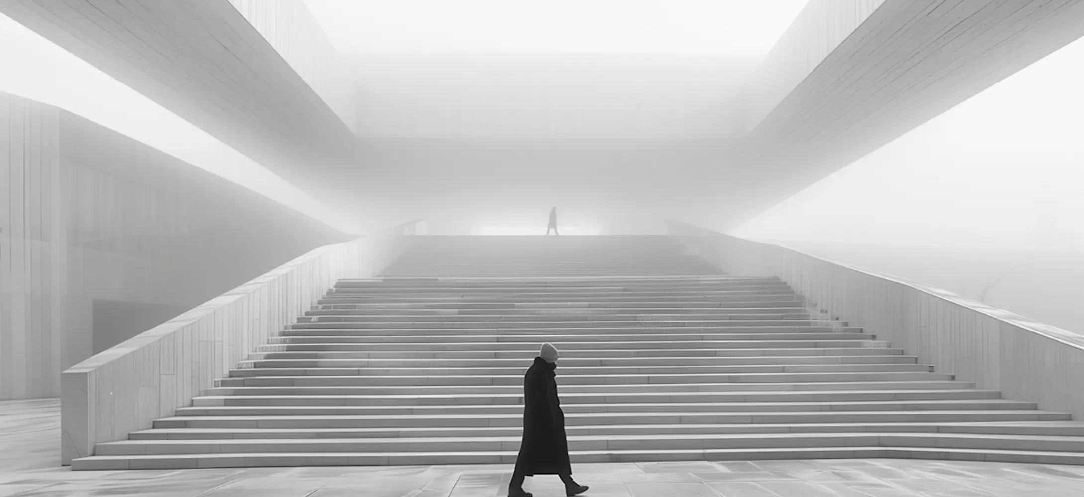
The Psychology of Clarity
Why do we choose this style? Because it promotes Mental Focus. In a world filled with visual noise, a high-contrast, minimalist environment acts as a "reset" for the brain. By removing mid-tone distractions, the inhabitant can focus on the geometry of the space and the quality of the materials. It is architecture as a form of mindfulness.
3 Tips for Your Next Project
- Avoid Pure Black Instead of #000000, use a "Near-Black" like your Deep Obsidian or a dark charcoal. It looks more natural and feels more expensive.
- Matte Over Gloss High contrast works best with matte finishes. Glossy surfaces create "hot spots" of reflection that break the clean lines you are trying to achieve.
- Frame the View Use dark window frames. They act as a picture frame for the outside world, pulling the green of the trees or the blue of the sky into your minimalist interior.